NDR’s Markup Language
NDR Core features a markup language which can be used to style the data in the result display and to create links to other pages, images or resources. This chapter does not directly refer to a section of the administration interface because markup tags can be used in several places. In general, there are two variants of markup tags: CMS and data-display tags. The Content Management System tags are used to create links to other pages, images or resources or to call User Interface elements.
The system is created thusly: there is a data object, a render template and a calling function for each element. This means that the system can be extended by adding a new render template, implementing the calling function and specifying the data object type. This is even easier for User Interface elements as the data object and calling function are already implemented. The render templates are created with Django’s template language and can also be overwritten by an installed NDR Core instance. This means that instead of adding new elements, publishing them and updating the installation, it is also possible to overwrite the rendering of an existing element and tailor it to the needs of the project. The rendering of the cms tags is done last, when CkEditor and Django have already rendered the page. There is a maximum of 50 cms tags per page. The mechanism is designed as a while loop which iterates over the content and replaces the tags with the rendered content. To prevent an infinite loop, the loop is limited to 50 iterations.
The data-display tags are used to render the data in the result display. The main difference
to cms tags is that they are designed to access a (nested) data field in a json object
and then apply filters to them. The data-display tags can be used to access the data in
this object and render it in a certain way. The main syntax is {data_key|filter}. The
data_key is mandatory, filters can be applied and are optional. Filters can be simple
filters as just shown or complex filters with arguments. The filters can be chained and are
applied in the order they are written. If the object the data_key is pointing to is a list, the
filters are applied to every element of the list. The example in Figure 4.4 shows a person
dataset which might be what NDR Core gets from the API.
Tag |
Description |
|---|---|
|
Creates a link to a page to an internal page and shows the page’s navigation label as link text. The parameter is the view_name of the page. Name is shown translated if applicable. |
|
Creates a download link to an uploaded file. The file_id can be retrieved from the uploads section in the admin interface. File name is shown translated if applicable. |
|
Displays a figure from an uploaded image. This is a convenience tag, so one does not have to create a User Interface element for each image. |
|
Creates a block on a page to be filled with content. You can write text directly to the background of your page but most of the time it’s prettier to have background color and then create blocks on the page to structure your content. |
|
Creates a link to a User Interface element. Each element features a name which can be used to call it in your content. All Content Management System tags can be called multiple times, also on the same page. An exception is the manifest_viewer element; it can be called multiple times but the selection of manifests or pages will always apply to all viewers on a page. |
The following examples show how to access the data and render it in a certain way. They are formatted in Python syntax to make it easier to understand, but can be used the search field expressions the same way (without the double quotes).
# results in "person-12345"
str_id = "{id}"

# results in "{’last_name’: ’Duck’, ’first_name’: ’Donald’}"
str_name = "{name}"

# results in "["prof-spec-1", "prof-manu-35"]"
profs = "{professions}"

# results in "prof-manu-35"
first_prof = "{professions.1}"

# results in "0000-0002-9541-1202"
str_orcid = "{meta.created_by.id}"
As seen on lines 2 and 5, the variable name of a JSON object can be used to access the data. The system returns the value of the variable. This value can be passed to a filter in its current form (for line 2 this is a string, for line 5 this is a JSON object) When it is rendered on the result display, all values are converted to a string. Lines 8, 11 and 20 show how to access a nested value. The different levels are separated by a dot. Lines 14 and 17 show how to access a list. Line 14 returns the whole list as a string (with comma as a separator), line 17 returns the second element of the list (indexes start from 0). All these examples can be used as such or passed to one or more filters. Filters can be simple and only have a name or complex and have positional or named arguments. The following code listing shows examples of filters, their syntax and their output
# results in "PERSON-12345"
str_id = "{id|upper}"

# results in "Unemployed, Coat button manufacturer"
# ( assuming the professions are configured as in the example above )
profs = "{professions|fieldify:professions}"

# results in ~ "<span color="#345645">Unemployed</span>"
prof1 = "{professions.0|badge:field=professions,color=by_value}"

# results in "<img src="https://link-to-iiif.host/image/23,45,678,234/full/default.jpg" />"
image = "{source.fragment|img}"
The first example shows a simple string filter. This one is called “upper” and converts the string to uppercase. The second example shows a complex filter with one positional argument. It will take a value (or a list of values) and look up the search field with the supplied name. This field needs to be a list-choice field and the filter will return the value (or the list of values) of the field. So if you supply the key “prof-spec-1” it will return “Unemployed” or “Arbeitslos” depending on the selected language. The fieldify functionality is also implemented in other filters like the badge filter. The badge filter does not need arguments, but they can be supplied. Because they are not mandatory, all arguments are named and only the needed ones need to be supplied. A badge is a small box with a colored background and some text.13 The badge filter takes the value of the data key and looks up the search field with the supplied name. It then returns the value of the field wrapped in the HTML code for a badge. By supplying the color argument, the filter will color the badge with the color of the value. Another example of a typical HTML filter is the img filter. It takes the value of the data key and returns the HTML code for an image tag with the value as the src attribute.
Tag |
Description |
|---|---|
String Filters |
|
|
Converts the value to lowercase. Has no impact on numbers. |
|
Converts the value to uppercase. Has no impact on numbers. |
|
Converts the value to title case. This means that the first letter of every word is capitalized. Has no impact on numbers. |
|
Converts the value to capitalize case. This means that the first letter of the first word is capitalized. |
Boolean & Default Values |
|
|
Takes a boolean value (or 0/1, on/off) and returns the true_val if the value is true and the false_val if the value is false. |
|
Returns the value as-is or a default value if the main value is empty. |
Field Lookup Filters |
|
|
Takes a value and looks up the search field with the supplied field name. Returns the (translated) value of the field. |
|
Takes a value and gets the info text from the search field with the supplied field name. |
Visual Styling Filters |
|
|
Renders the value as a Bootstrap badge. If the field parameter is supplied, the filter will look up the field with the supplied name (like fieldify). Both color fields (color is for the text color, bg for the background color) can be supplied. The tt parameter adds a tooltip (use “__field__” to show field info). The bg parameter supports gradient values. |
|
Same as badge but with pill styling. |
|
Renders lists as HTML ul or ol elements. Type can be “ul” (default) or “ol”. The class parameter adds CSS classes. |
Image & File Display |
|
|
Renders images with IIIF support. The iiif_resize parameter is a percentage (0-100). Supports [placeholder] syntax for dynamic URLs. Default class is “img-fluid”. |
|
Displays text file content previews (txt, json, md, xml, csv, etc.) with syntax highlighting. The max_lines parameter defaults to 1000. |
Date & Number Formatting |
|
|
Formats dates from one format to another using strftime format codes. The format parameter specifies the input format (default: “%Y-%m-%d”), and o0 specifies the output format. |
|
Formats dates as relative time (today, yesterday, 2 days ago, etc.). The format parameter is used as a fallback for older dates. |
|
Formats numbers using Python format specifications (e.g., “.2f” for 2 decimals, “,d” for thousands separator). |
|
Formats numbers with thousands separators for readability. Default separator is apostrophe (‘). |
|
Formats numbers in compact form with K, M, B suffixes (e.g., 21438 → 21.4K). Default precision is 1. |
Links & Navigation |
|
|
Wraps content in anchor tags. The url parameter supports [placeholder] syntax. The page parameter accepts NdrCorePage view_name or ID. The params parameter accepts format “param1=value1,param2=value2”. The display parameter can be set to “button” for Bootstrap button styling. |
|
Validates and formats ORCID IDs with icon linking to orcid.org. |
|
Generates list of favicons linking to provided URLs. Processes entire lists. Default target is “_blank”. |
Embedded Content |
|
|
Embeds content in iframe tags with security options. Default width is “100%”, height is “400”. Supports sandbox, loading, and referrerpolicy attributes. |
Maps & Visualization |
|
|
Displays coordinates as interactive Leaflet map with markers. Supports GeoJSON, coordinate pairs, nested structures (lat/lon or latitude/longitude), and multiple markers with groups. The groups parameter uses format “Name:key:color,Name2:key2:color2”. Default width is “300px”, height is “200px”, zoom is “10”. The marker parameter can be set to “false” to hide markers. The legend parameter can be set to “false” to hide the legend. Coordinates can be provided as floats or strings. |
|
Renders Plotly interactive visualizations with dark mode support. Requires Plotly.js library. Default height is 400px, width is “100%”. Input should be dict with ‘plotly_figure’ or ‘data’/’layout’ keys. |
Text Formatting |
|
|
Truncates long text with optional expand/collapse functionality. Default length is 200 characters. The expandable parameter defaults to true. |
|
Renders code blocks with optional syntax highlighting. Supports languages: python, json, javascript, html, css, etc. The linenumbers parameter defaults to false. The wrap parameter enables word wrapping. |
Tables |
|
|
Renders list data as HTML table. The cols parameter is an array of column keys (supports dot-notation). The headers parameter is an array of header labels. The expr parameter is an array of filter expressions (separated by semicolons) to apply to each column. The tstyle parameter can be: plain, small, striped, bordered, hover, sm-striped. The limit parameter restricts rows displayed. Processes entire lists. |
|
Renders interactive data tables using Tabulator with pagination, filtering, and sorting. Extends table filter with interactive features. The paginate parameter defaults to true, pagesize to 10. The filterable and sortable parameters default to true. The layout parameter can be: fitData, fitColumns, fitDataFill. Processes entire lists. |
Filters can be added to NDRCore by implementing the AbstractFilter class of the
system. The methods which need to be implemented define the number of mandatory
positional arguments and the possible named arguments. The most important method
is the “get_rendered_value” method which takes the value of the data key and the
arguments and returns the rendered value. See Listing 4.4 for a list of implemented filters.
NDRCore supplies base classes to use for these filters. For instance, there is a HTML
element class which can deal with different arguments and classes of an element provides
color management functionality for the different ways, colors can be supplied.
Colors are either supplied by giving a valid CSS color name, a hexadecimal color code
or a RGB/HSL color code. Additionally colors can be Bootstrap color names (primary, secondary, … )
or set to one of the following keywords: val__<field_name>,
byval__<field_name> or byval . See the following examples for an explanation of
these keywords.
# results in <span class="badge badge-primary">Unemployed</span>
badge = "{professions.0|badge:field=professions,color=primary}"

# <span class="badge" style="color:#112233;">Unemployed</span>
badge = "{professions.0|badge:field=professions,color=#112233}"

# <span class="badge" style="color:#123456;">Unemployed</span>
badge = "{professions.0|badge:field=professions,color=val__mycolor}"

# <span class="badge" style="color:#123456;">Unemployed</span>
badge = " { professions .0| badge : field = professions , color = byval__info } "

# <span class="badge" style="color:#123456;">Unemployed</span>
badge = "{professions.0|badge:field=professions,color=byval}"
The first example shows the use of a color name, the second one shows the use of a
static color code. The next three examples use the value of the search field configuration
for the supplied key. This means, for example, that the value of {professions.0} is the
key “prof-spec-1”. This functionality assumes, that in the professions search field, there
is a line with the key “prof-spec-1”. In this line there is a value (“Unemployed”) and
mycolor-column. The latter has the value “#123456” in this example. If the color keyword is
set to val__mycolor, the filter will look up the value of the mycolor-column
and use it as the color. If the color keyword is set to byval__info, the filter will look
up the value of the info-column and use it to calculate a color. The calculation is done
by taking the MD5 hash of the value and converting it to a HSL color code. The last
example (“byval”) does this calculation with the key itself.
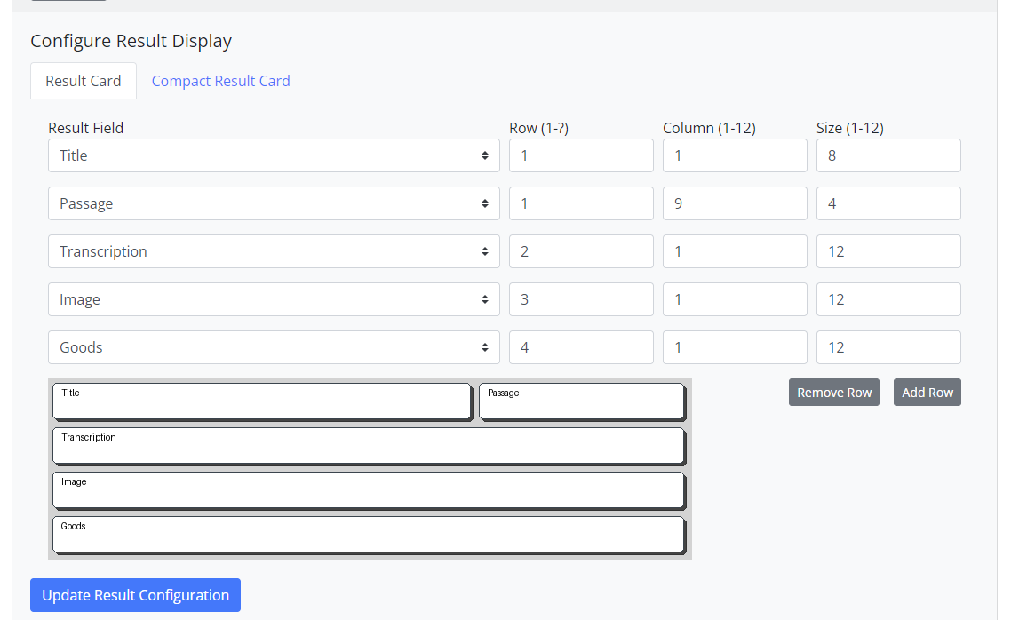
In conclusion, the NDR Core filter system may be a bit of a steep learning curve for someone who is not used to work with this kind of syntax but it is as similar as possible to the Python string formatting syntax and implemented in a flexible and extendable way. Together with the grid system and the possibility of formatting with the CkEditor, it allows for a lot of flexibility in the creation of result displays and is thus able to cater to the very diverse needs of research projects.